My Role
UX Lead for Replenishment — end-to-end, from research through prototyping to developer handoff, partnering with a product manager and engineering team within Home Depot’s Enterprise Supply Chain program.
Background
The Home Depot was running its distribution centers on two aging, expensive warehouse management systems that were hard to customize. In response, Home Depot stood up an Enterprise Supply Chain program to build a proprietary WMS from scratch, with dedicated Agile teams for each major workflow — inbound, receiving, putaway, replenishment, picking, and outbound.
Problem
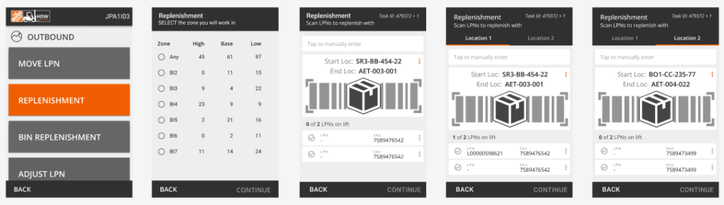
We had already shipped the Replenishment module to the RF handheld devices associates carry on the floor. Once it was live, a pattern emerged: replenishment tasks weren’t getting completed in time to keep pace with outbound picking, which meant inventory wasn’t in place when pickers needed it, causing a measurable rise in missed picks. The associates had a device to do the work. What was missing was a way for the operations managers running the shift to see, at a glance, which tasks were falling behind before it became a picking problem.
Research
I ran six interview sessions with replenishment operations managers across different distribution centers — some in person on the floor, some remote — to understand how they currently tracked task progress and where that broke down. Three things came out consistently:
– Managers had no single view of task status; they were piecing it together from radio calls and walking the floor, which didn’t scale once volume spiked.
– Not all incomplete tasks were equally urgent — managers needed to see which ones were about to block a pick, not just a flat list.
– When they did find a problem, they needed to act on it immediately — reassign a task, pull in a person — not review it after the fact.
I synthesized these into a set of recommendations and walked them through with the team and stakeholders before moving into design.
Solution
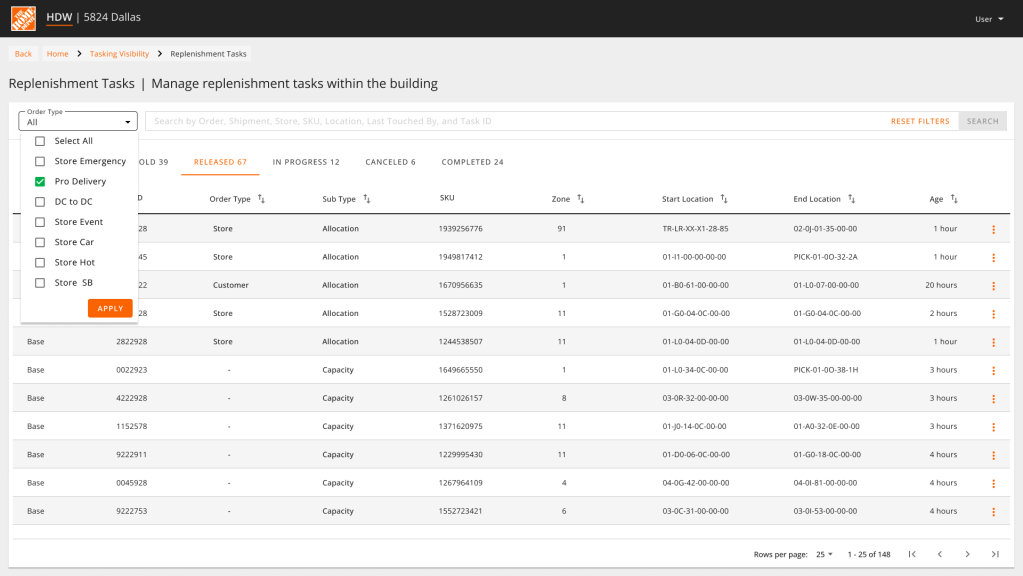
I designed a Replenishment Visibility Tool: a sortable table showing every task for the current shift, grouped by status (Released, In Progress, On Hold, Completed, Canceled) and ranked by priority within each group, so the tasks needing immediate attention always surfaced to the top. Data updated in real time, and managers could filter and search by multiple criteria to isolate a specific area, item, or associate.
This became the operations manager’s desktop companion to the RF device on the floor — one showing the work as it’s being done, the other showing where it’s falling behind.
Validation
Using the Supply Chain Figma design system, I built design comps and wrote Jira stories for development. I tested the flow on the warehouse floor prior to go-live, focusing on three questions: could managers correctly read task status and priority at a glance, could they find what they needed through search and filtering, and did the real-time updates match their mental model of “what’s happening right now.”
Along with some adjustments to the screen location of the banners that indicated immediate action was necessary, I realized that change management was going to be necessary. Initially, both the floor workers and operations managers reacted to replenishment areas that didn’t have much inventory available, even though those locations weren’t the highest priority because of the low number of upcoming orders for that SKU in the system.
I refined the comps based on those findings and documented the resulting Jira stories for developer handoff.
Outcomes
With real-time visibility into task status, priority, and inventory location, operations managers could reprioritize and staff dynamically instead of reacting after a pick was already missed. Distribution centers using the tool saw fill rates improve by over 10%.

